The Most Accurate Online IQ Test
Assess your IQ with precision using a cutting-edge adaptive online IQ test, developed by the CheckIQ™ research team.
Start the IQ Test Now
Recent IQ Test Results
Nigeria | IQ Score: 88
United States | IQ Score: 106
Belarus | IQ Score: 109
Italy | IQ Score: 109
United States | IQ Score: 104
United States | IQ Score: 105
United States | IQ Score: 102
Pakistan | IQ Score: 105
Chile | IQ Score: 105
Latvia | IQ Score: 98
Turkey | IQ Score: 102
Indonesia | IQ Score: 93
Australia | IQ Score: 103
Bulgaria | IQ Score: 105
United States | IQ Score: 97
India | IQ Score: 103
Thailand | IQ Score: 108
Japan | IQ Score: 135
United Kingdom | IQ Score: 109
India | IQ Score: 107
Why Take an IQ Test?
Taking an IQ test is not just a brain workout. An IQ test can result in a lasting impact in your personal life and in your career. Ultimately, it's about knowing yourself better, which is the key to success.
Create a Pivotal Moment in Your Life
Are you living up to your potential? Intelligence tests like CheckIQ can be the spark of confidence you need to change your life
Compare Your Intelligence to Your Peers
Over 700,000 people have taken our IQ test. See how your IQ compares to the average IQ and to people in your age group and country.
Discover Opportunities That Match Your Potential
Our reliable IQ test reveals your strengths, helping you choose the career and educational paths that fit you best.
-
As a large body of research now shows, IQ is also predictive of life outcomes
-
High-IQ students achieve higher academic results than other students
-
IQ is the single most important predictor of work success. It’s a very robust and very reliable predictor
-
General cognitive ability is a significant predictor of performance in computer tasks
-
Research indicates that IQ scores are a strong predictor of academic success
-
Individuals with higher general intelligence can expect to enjoy more favorable life outcomes

-
Zimmer P, Kirkegaard EOW. Intelligence really does predict job performance: A long-needed reply to Richardson and Norgate. OpenPsych. 2023; Published February 12, 2023. doi:10.26775/OP.2023.02.12. Available at: https://openpsych.net/files/papers/Zimmer_2023a.pdf.
-
Guez A, Peyre H, Le Cam M, Gauvrit N, Ramus F. Are high-IQ students more at risk of school failure? Intelligence. 2018;71:32-40. doi:10.1016/j.intell.2018.09.003.
-
Antonakis J. Does IQ determine success? A psychologist weighs in. CNBC. July 11, 2022. Available at: https://www.cnbc.com/2022/07/11/does-iq-determine-success-a-psychologist-weighs-in.html.
-
Lintunen E, Salmela V, Jarre P, Heikkinen T, Kilpeläinen M, Jokela M, Oulasvirta A. Cognitive abilities predict performance in everyday computer tasks. Int J Hum Comput Stud. 2024;192:103354. doi:10.1016/j.ijhcs.2024.103354.
-
Petruse R, Grecu V, Grecu V, Chiliban MB, Tâlvan ET. Comparative Analysis of Mixed Reality and PowerPoint in Education: Tailoring Learning Approaches to Cognitive Profiles. Sensors. 2024;24:5138. doi:10.3390/s24165138.
-
Vance GS, DeLecce T, Shackelford TK Men's general intelligence and heterosexual romantic relationship outcomes. Pers Individ Dif. 2025;233:112902. doi:10.1016/j.paid.2024.112902.
How To Measure Your IQ Online
You answer IQ questions
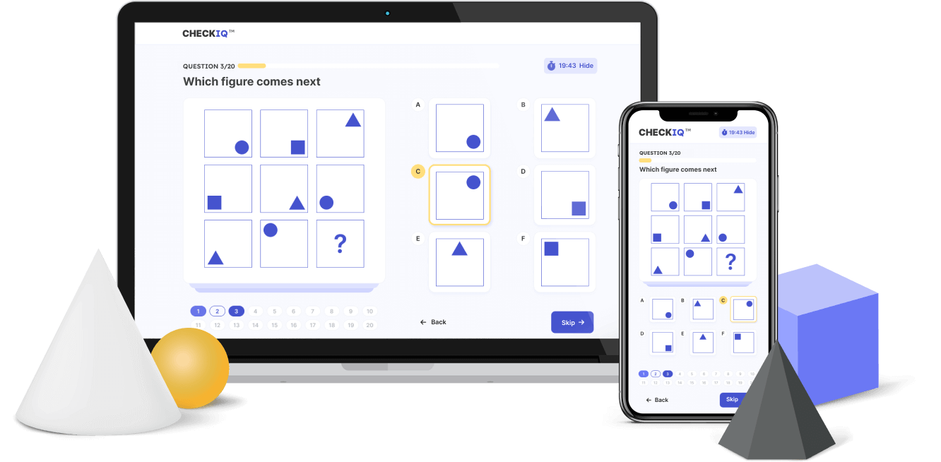
Find a quiet and comfortable environment to focus on the test. The IQ test questions are selected from a large database, starting with easier ones and becoming progressively harder based on whether you answer correctly. Answer the questions to the best of your ability without distractions. Don't worry if you're unsure about some questions as you can skip them and return later!
Take the Test Now

We calculate your IQ
We use the official method for IQ testing to calculate your score accurately and fairly. First, we calculate your raw IQ score by analyzing your answers, the time you take to respond, and the highest level you achieve out of 20 difficulty levels.
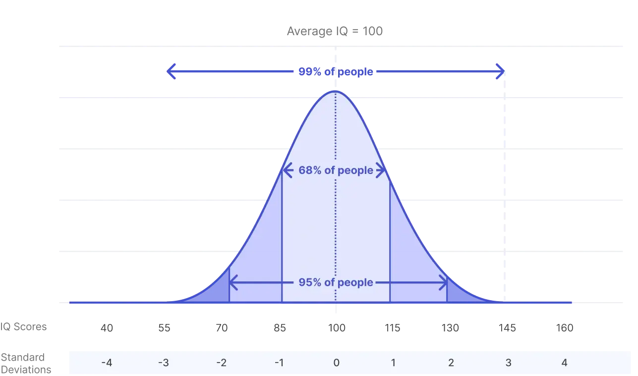
Next, we calculate your z-score, which shows how far your score deviates from the average IQ score of 100, based on standard deviations. Finally, this z-score is converted into a percentile, which indicates what percentage of the population scored lower than you. For example, if your percentile is 98, it means your score is higher than 98 percents of people.
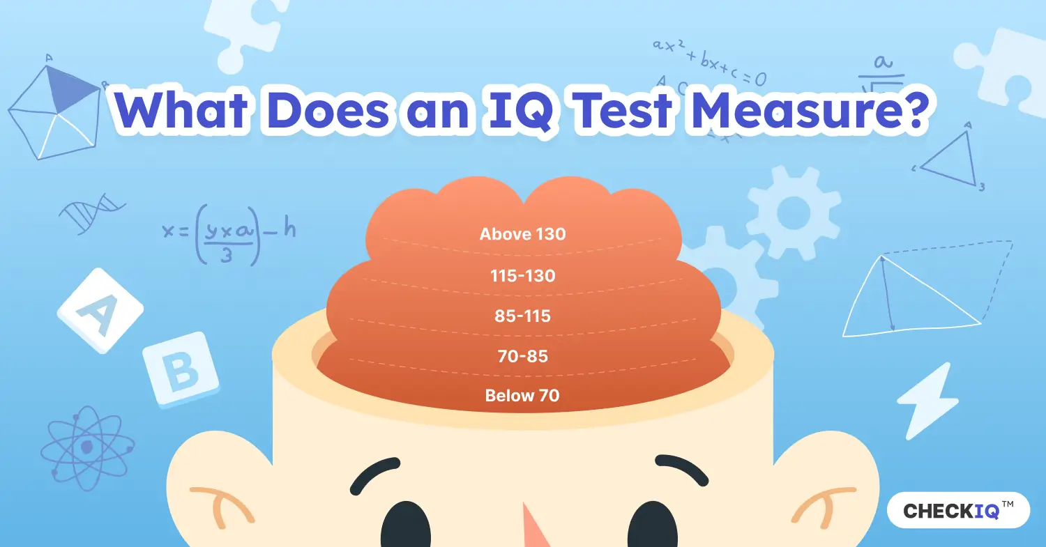
Your results are also placed on a bell curve, a graph showing how IQ test scores are distributed across the population. Most people (about 68 percents) score between 85 and 115, which is considered the average IQ range. Scores above 130 are classified as "high IQ scores" or "gifted." Scores below 70 are considered lower IQ scores.
Get your IQ results
After completing the test, you'll be able to get your IQ score along with detailed results and analytics. You'll discover your IQ category, based on official IQ test standards, and gain deep insights into your cognitive skills to better understand your strengths and weaknesses. Additionally, you'll have the option to download a personalized IQ test report and our official IQ test certificate to showcase your achievement.

What People Say
-
Fun test to challenge yourself


-
Been practising online IQ tests yearly ever since but it's hard to find a good online IQ test


-
I tried this IQ testing site during my lunch break. Overall I'd say it delivers with it promises.


-
Solid IQ test, got a 132 which is in line with WAIS I took 2 years ago (135) and Mensa 6 months ago (128 on first attempt)


-
A solid IQ test and one of the very few that increases difficulty dynamically


-
I tried this test today after exploring a few other sites, and this one was by far the best


-
I was pleasantly surprised by this IQ test, as it seems more rigorous than others I have had the opportunity to try


-
Good non-verbal skills IQ test


-
An IQ test that provides a comprehensive analysis of your intellectual abilities. Highly recommended!


-
The questions are more challenging than in other IQ tests, but the scoring is more accurate


-
The IQ itself is on par with the WISC-V I took a while back


-
A big plus is that the questions adapt to your % of correct responses


-
Not easy but serious. I took this online IQ test twice: the first time I scored 115, the second time 118


-
I initially tried this IQ test out of curiosity and ended up taking it three times


-
The questions in this IQ test are very diverse. The report is very detailed and easy to understand.


Features
100% dynamic
Unlike most online IQ tests that use the same set of questions for everyone, our test adapts to you by adjusting the difficulty of each question based on your previous answers. You start at Level 1 and progress through 20 levels of difficulty.
Backed by science
Our cognitive research team studied trusted IQ tests like the WAIS, the Stanford-Binet, and Raven's Matrices. By learning from the best IQ tests, we've designed an accurate IQ test that combines elements of the classical IQ test and modern adaptive methodologies.
Designed for accuracy
As an adaptive IQ test, CheckIQ needs fewer questions to accurately assess your IQ. The result is a more accurate IQ test that measures your intelligence level in a fraction of the time required by traditional tests.
6,000+ questions
Over 6,000 original IQ test questions created by cognitive researchers and reviewed by psychologists. Each time you retake the test, you'll get new questions, ensuring an unbiased and accurate assessment.
Comprehensive
These IQ test questions cover a broad spectrum of cognitive abilities, including logical reasoning, pattern recognition, abstract reasoning, and spatial awareness, all evaluated under time constraints.
Daily updates
With daily updates and fresh questions, Check IQ™ evolves constantly through ongoing feedback and rigorous testing, ensuring a smarter, more dependable, and insightful IQ testing experience every time you take it.
Detailed analytics
Identify your strengths to areas for improvement, with detailed analytics that provide a comprehensive breakdown of your performance. See how you compare with people the same age and country.
IQ certificate
Showcase your intelligence with a personalized IQ certificate that shows the highest IQ score you've achieved. You'll also get a dedicated online link for sharing with your professional network.
IQ training
Improve your mental fitness with daily brain workouts, including IQ questions, brain teasers and memory quizzes. Collect streaks and see your progress over time.


